Here is the link to the exercise files for this video
https://drive.google.com/drive/folders/1KRtO_eUhtS5RNnhGEKlscoeDM7oMY8F3?usp=sharing
This was an image sent by one of our students of “The Complete Sketchup & Vray Course for Interior Design.”
We did some tinkering with the Sketchup file that he sent us and we were able to produce the below output with minimal tweaks. Here are ways to improve your Interior Renderings.
In this article, you will learn to transform your burned-out image to something awesome like above.
Improve your Interior Renderings
1) Changing your Camera Eye Height | Composition
In the first image that our student sent us, you can see that the eye height is given at about 5′-0″ to 6′-0″. This is not a good eye height for interior design shots.
A good principle to follow while making interior design renders is to the eye height at waist level. This is a technique followed by most professional Interior Design Photographers too.
What is waist level height?
A height between 3′-0″ to 4’0″ (900 mm to 1200 mm)
The reason behind this is to achieve perfect perspective before clicking on that render button. And this is more advisable for taking shots of furniture and decor.
To change the Eye Height in Sketchup.
1 )Go to Camera > Position Camera and place your camera in the scene.
2) Then change your eye height & press Enter
This also follows composition principles when composing your interior design shot.

2) Keystoning
Keystoning distortion is a term which most photographers are familiar with. It is the apparent distortion of the image where the lines are slanted and form more of a trapezoid effect like a 4-point perspective.
It is always important to keep your lines perfectly horizontal or vertical before you click on that render button.
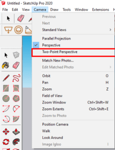
When you see the student’s render above, you can notice that the vertical wardrobe lines are not perfectly vertical and they start tapering off. So how do we fix this in Sketchup? Simple!
Go to Camera and Switch on Two-point Perspective
It will automatically correct any slanted lines, provided your camera is positioned correctly in the scene.
3) Soft Shadows
Having sharp shadows & direct sunlight fall into the scene is unnatural. The photos which take your breath away are the ones that play with soft light & shadows.
So here’s my best tip which I only share in Section 03 of this course where we design & render a Swing Wardrobe.
Go to Sunlight Settings
> Change Filter to Override (so we get white light into the scene, you can change the colour as per your artistic taste)
> Change Size Multiplier to 100 *most important*
You will be amazed by the renders you will be able to produce like what was seen in the 2nd image above.
4) Increase the overall Exposure
Change the shutter speed in your Vray Asset Editor to make your space look brighter. The last thing you want is an underexposed rendering of your space.
To change your shutter speed
> Go to Vray Asset Editor > Settings > Advanced Camera Parameters
> Change Shutter Speed from the default value of 300 to 100.
5) Final Tip - POST PRODUCTION with a capital P
To really achieve, you need to post produce your image and Vray Next has given you this ability by using their in-built post production tools.
Here are some tips for post production
1. Change values very subtly. (Don’t go crazy with the values) – Change according to your taste
2. S-Curve is your key to beauty. Because it boosts the shadows & highlights in your scene
3. Adjust Exposure, White Balance, Hue/Saturation (in very less values), Color Balance, & of course Curves.
4. Take it to Photoshop if required & add an LUT (a video about this will come out soon)
5) Bonus Tip - Play around with the Lens Effect Settings (bonus but not required)
The Archgyan Podcast is sponsored by our Courses. Sign Up Now to start your Architecture & Interior Design Journey.

